Overview
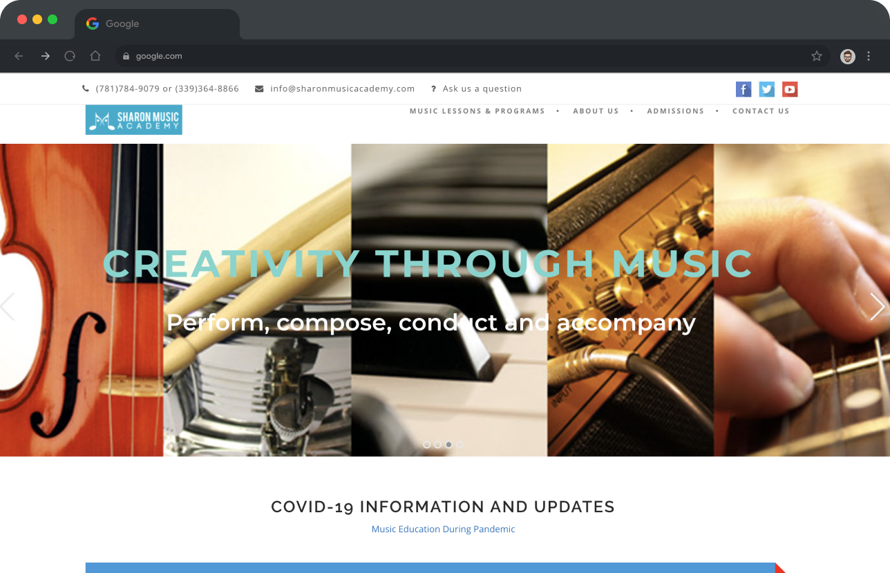
Sharon Music Academy, a music school situated down the street from my childhood home, had been utilizing an outdated and somewhat confusing WordPress theme for its website. Recognizing the need for an upgrade, the owner, Sergey, approached me to redesign and rebuild the site. Our primary aim was to create a modern, user-friendly platform that provided clear information and was easy to maintain.
Guiding Questions
- What should be the website's visual mood and aesthetic?
- What is the impression that the website should make on the visitor?
- What are the most important pages that a viewer should be able to navigate to?
- Where should we direct the user flow?
- How do we keep the website easy to maintain for the owner?
Background
The old theme that the website was running on looked dated and the styling throughout was not cohesive. The theme was also incompatible with contemporary Wordpress updates, so Sergey had not updated Wordpress in years. This, in turn, opened the site up to a litany security issues.
Visual Design Process
We decided that it would be most efficient to rebuild his site on Wordpress again, as he was already renting a web hosting space for Wordpress. I suggested that alongside a new theme, the Wordpress CMS could be programmed so that he could have an easier time updating the content himself.
Research and Moodboarding
Sergey wanted the website design to be "modern, straightforward, and educational-feeling." He liked the clean white background from his old website, so during the research process, I included many websites in the moodboard that had a white background.
Wireframing
I started wireframing by mocking out layouts with placeholder image frames and no typography styling, other than type size and weight. I used different shades of grey to mock out color and section changes. I forgot to make a copy of my finallized wireframes and went right ahead and applied styles to my wireframes. Sorry!
Final Visual Design
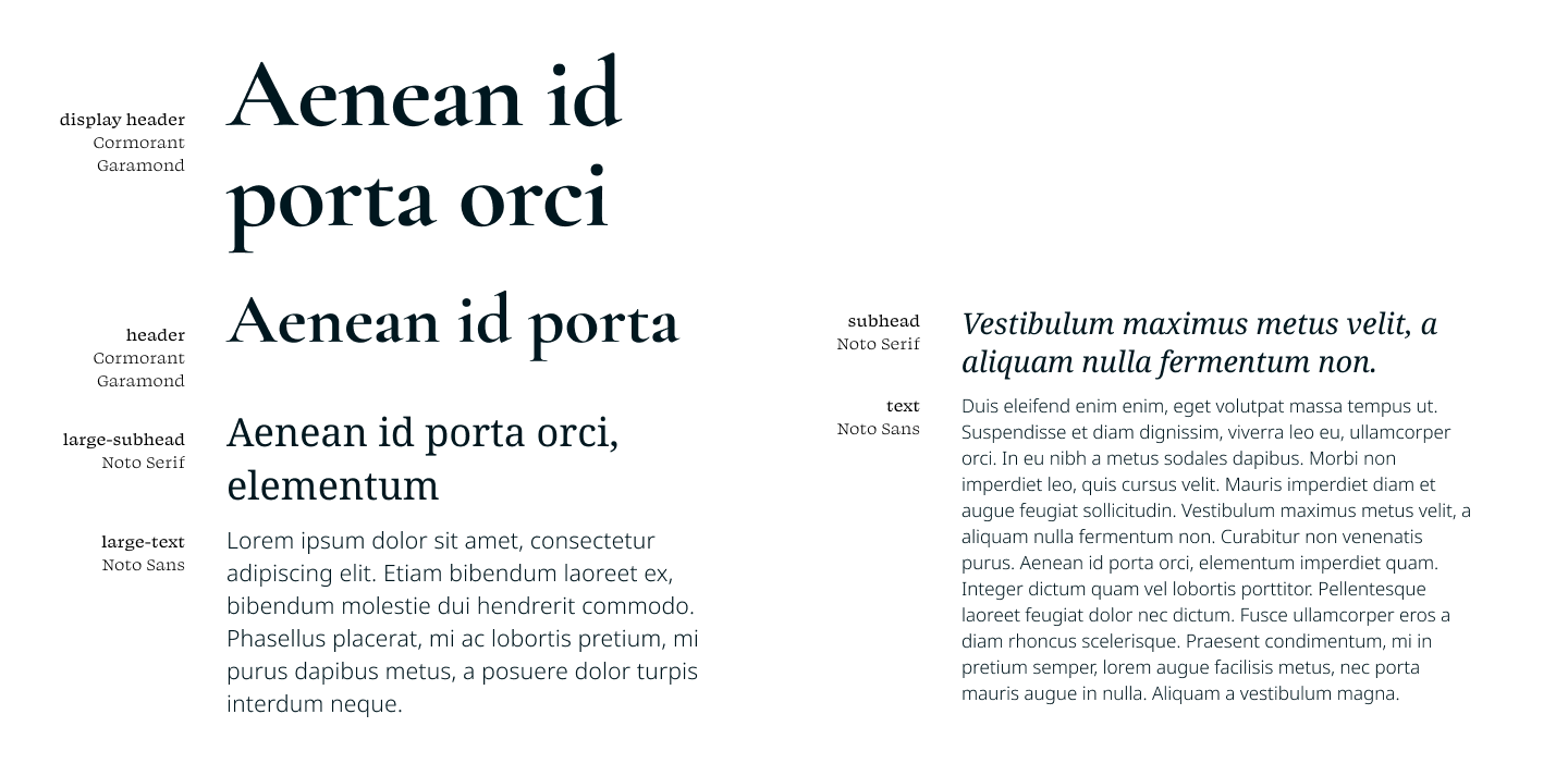
Color Palette
To stick with the goal of keeping the design informative, I decided to make the color palette very simple. I started with white, black and a grey during wireframing, so I changed that to white, black and a light tan. I added in a dark blue for light text on dark section backgrounds, as just using black was too austere. For the action highlights I added in a bright blue and orange.

Typography
To keep costs low, and for ease of maintenance and implementation, I chose typefaces from the Google Fonts library. Looking back, I could have simplified the type heiarchy by just using Noto Serif for all of the headers, but at the time I liked the atmostphere that a classical font like Garamond brought to the layouts. Also, cormorants are one of my favorite birds :D.
Imagery
For the images, Sergey told me that he wanted to use a mix of stock images and his own photography of his students. I started with a simple shape clip of the images, but to add a bit more visual interest, and a little illusion of depth, I had a portion of the subject, with the instrument, breaking out of the shape. To include more color, I added in a decorative element of soundwave like lines.

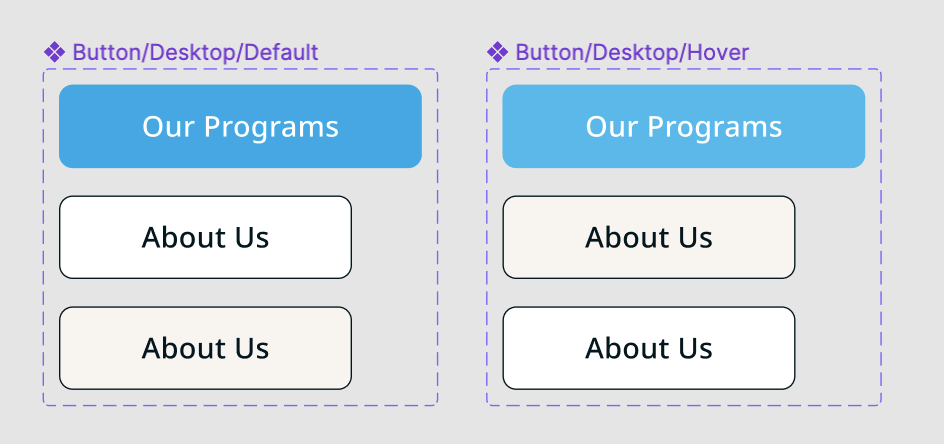
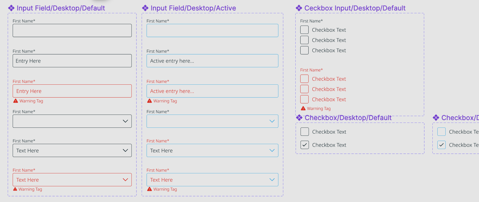
UI Elements
I kept the UI elements simple, as simplicity and straigforwardness are some guiding principles for the whole design.
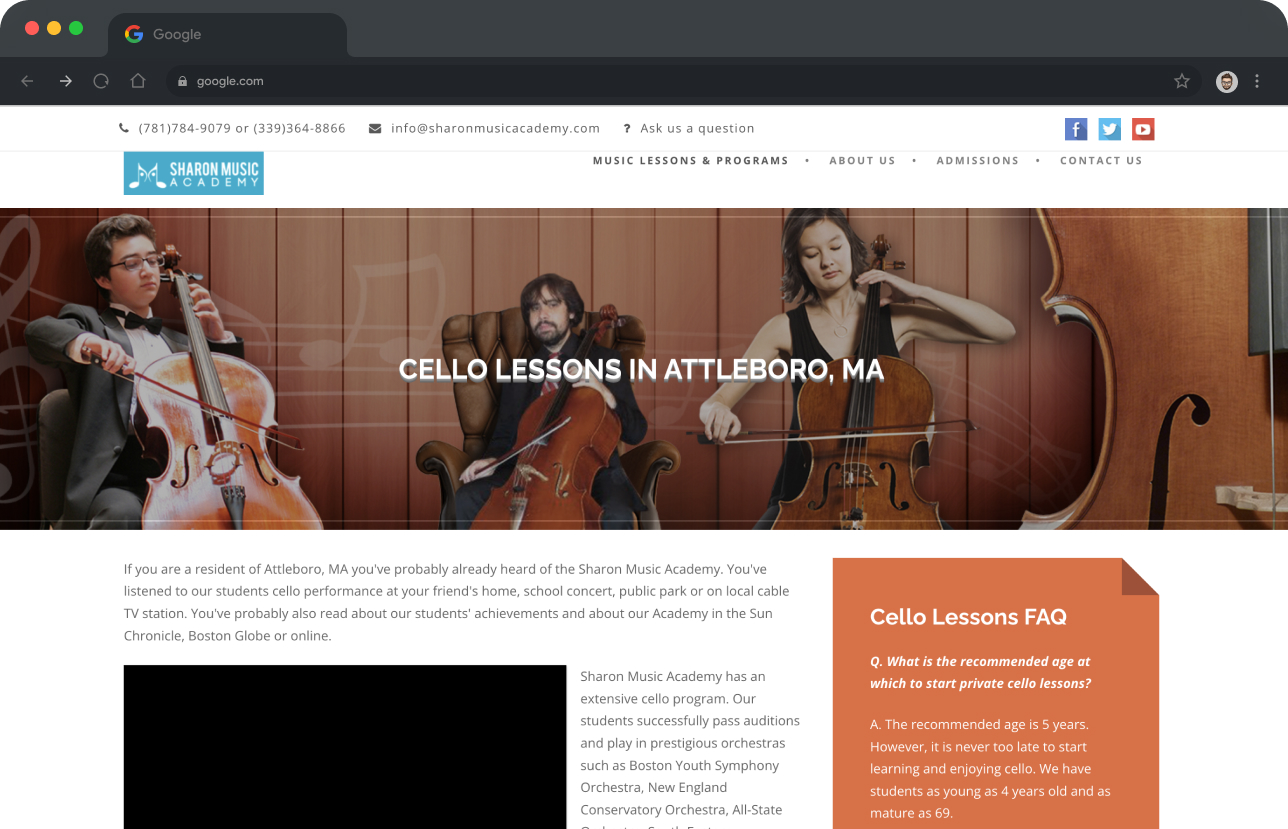
Layouts
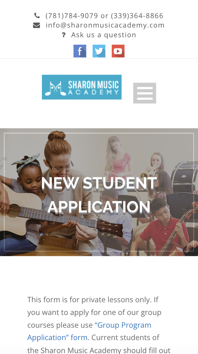
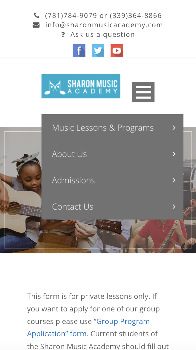
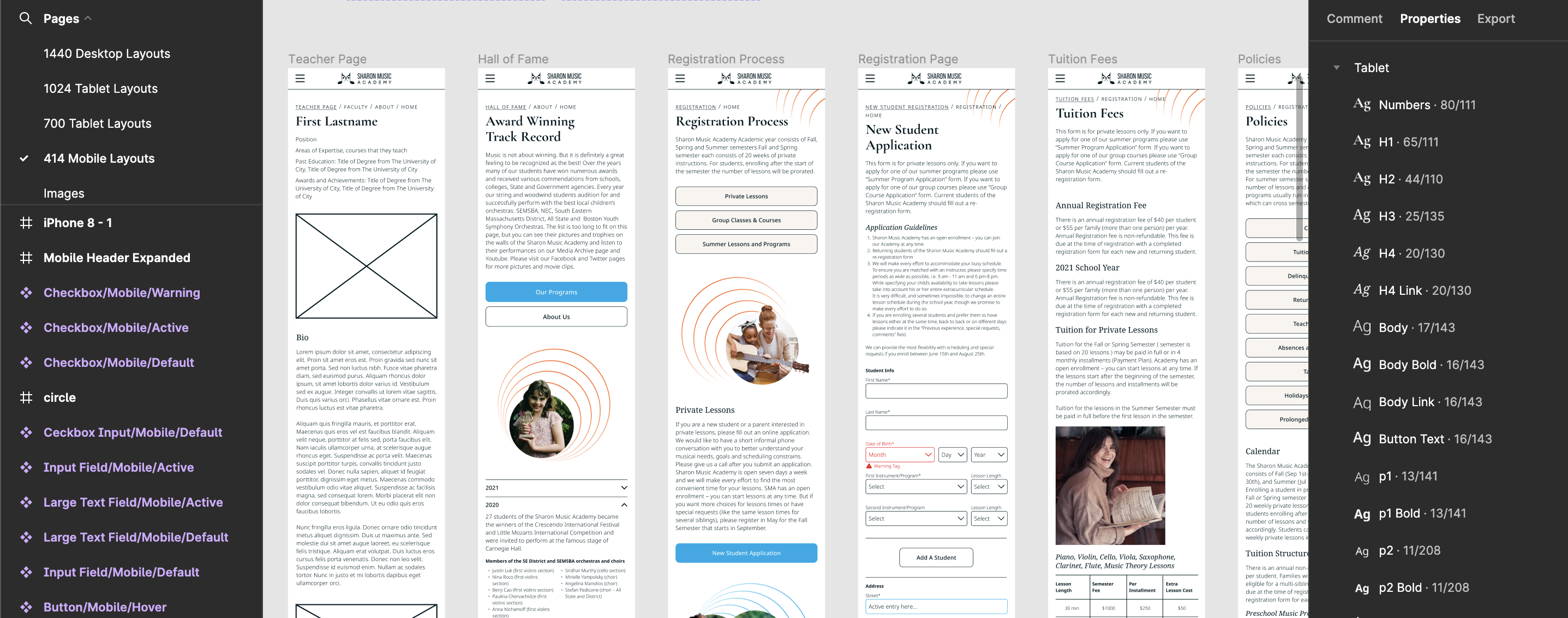
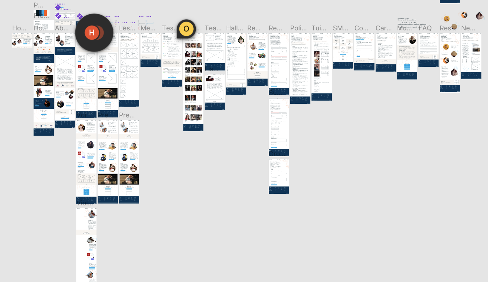
There are a lot of pages, and page types, to layout. Sergey wanted to see how the styling worked on over 25 different pages, so I laid out them all out for him. I also sort of went crazy and planned out ~20 layouts for all of the responsive breakpoints (1440px, 1024px, 700px and 414px). Check out my Figma file here.
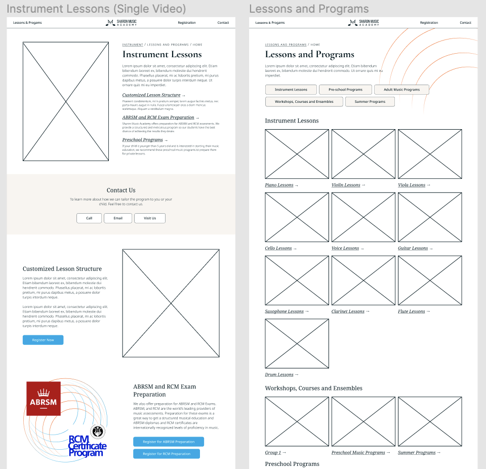
Faculty Pages
Research
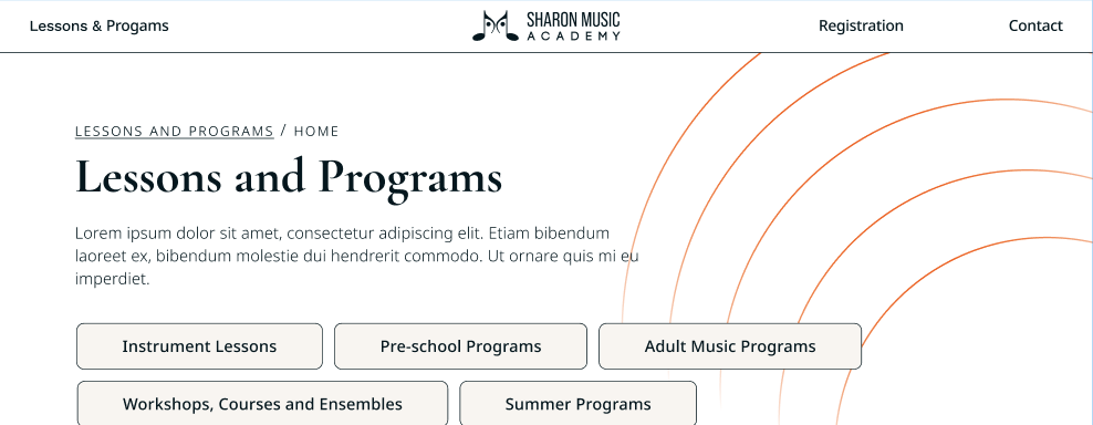
One area that stood out to me during the client interview was that Sergey said to me that one of the most visited pages on the previous version of the website was the Faculty page. Parents really wanted to know the qualifications of the teachers that they would be sending their kids to.
Problem
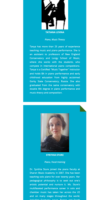
The old Sharon Music Academy website's faculty page used a single-page layout, with department headers dividing the teacher bios. Each teacher was displayed with a profile picture and a short biography. However, the design made navigation difficult, as users had to scroll extensively to locate specific instructors.
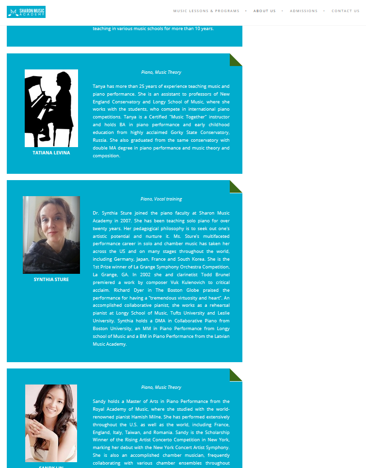
I needed to restructure the display of the Faculty information to better communicate the qualifications and represent the 'roster of world class musicians' that are teaching at Sharon Music Academy.
Solution
To improve usability and credibility, the faculty section was redesigned as a collection of individual pages—one for each faculty member. This not only made navigation easier for users and simplified content management for Sergey, but also increased the academy's credibility. By giving each teacher their own dedicated page, the website conveyed a greater sense of professionalism and prestige, similar to what users might expect from a university or conservatory site.
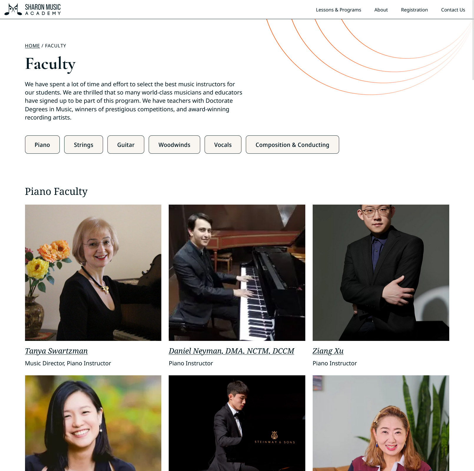
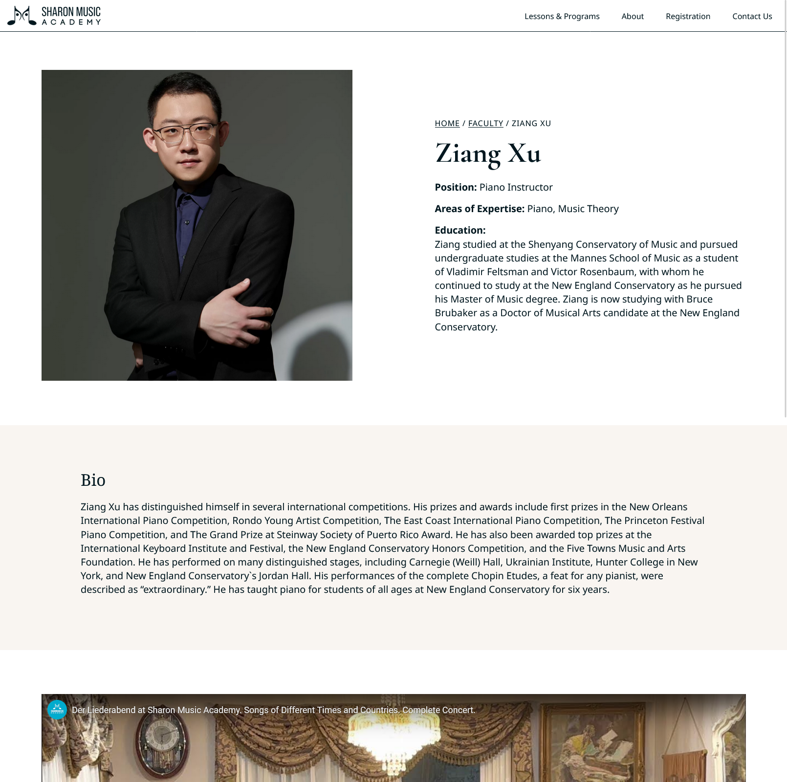
Furthermore, individual pages allowed for a more comprehensive presentation of each instructor, including their position, areas of expertise, education, and achievements. This reinforced the academy's commitment to high-quality instruction, helping to build trust with prospective students and parents.
Develop
After I delivered the designs to Sergey, I offered to help him implement the website for him. Here was where I could address the goal of making sure the website was easy to maintain and keeup updated and secure.
Website Platform
We decided to stick with Wordpress, in order to leverage existing infrastructure on his web server. However, to avoid future security issues, we needed to use a Wordpress theme that would remain compatible with the current and future Wordpress updates. Since I had previous experience with Oxygen, a Wordpress visual theme builder, I used that plugin with some custom php here and there, to implement all of the page template layouts. Oxygen receives frequent updates and bug fixes so the website should always be able to run the most up to date version of Wordpress
Backend Structure
Another part of making the website easy to maintain, was organizing the site map, and the Content Management System (CMS). I needed an CMS that Sergey can use to manage the music lessons and courses, registration and tuition information, faculty information, and other SMA information that is displayed to the user. Wordpress was a good choice since Sergey already had some experience using the platform.
As part of organizing the CMS to make the site as easy to use as possible for Sergey, I began by restructuring the sitemap to identify the custom post types and taxonomies needed to support the site's diverse content. Using the Metabox plugin, I created several custom post types, custom fields, and input forms designed for straightforward content management. By organizing content types under dedicated admin sections, I improved both the backend workflow and the overall structure of the site. These custom post types also support dynamic content reuse—updates made in one place automatically appear across multiple areas—boosting both efficiency and consistency. While the code isn’t the cleanest, I’m proud of the practical and thoughtful solutions I implemented to meet Sergey’s needs.
Final Site
Reflection
Getting Things Done
Well it is obvious that it is important to get things done. What I mean is that even though there are always more improvements to make, when implementing a website, sometimes the minimum viable product is the fastest and best solution. Many times throughout this project, I wanted to include features and add more functionality, but after discussing with the client, some of these features got shelved for later.
Design for Handoff
Since I did both the design and development for this project, I got to experience both sides of the workflow. I kept my Figma files organized and labelled, and as a developer I appreciated that while building out the design. I wish I planned out the type heiarchy differently in Figma; I labeled them after the element tags (ie. h1, p, body), when I think would have been much easier to just simply give them descriptive class names. I also planned out the type sizes for desktop, tablet, and mobile, when in the end I just simply used CSS clamp() to make the type responsive.