Overview
I worked on this project as a part of Scout, Northeastern's student-led design organization. At Scout, you are assigned a team of other student designers and client (usually from Northeastern's IDEA venture accelorator club, or Entrepreneur Club). Over the course of a semester, you work with your team to solve the client's design problems. For this project I worked with Sam Marchesi, our project lead, Phoebe Lasater, Josie Britt, and Sam Steenstrup. We joined Rooted Living to establish its brand identity, craft packaging for its flagship product, and enhance its social media presence through the creation of templates and assets.
Snacking with an Impact
Rooted Living is a snack enterprise based in Boston, offering sustainable snacks designed for eco-minded consumers. Rachel Domb, the founder of the company, recognized a lack of truly sustainable snack options in the health food market. Motivated by this observation, Rachel established Rooted Living with the goal of empowering consumers to enjoy snacks without compromising their health or the planet's well-being. All products are carefully packaged in compostable materials and are free of refined ingredients, ensuring both consumer satisfaction and environmental responsibility.
Learning About the Brand
Our project kicked off with a thorough exploration with our client, Rachel, to define the brand voice, target audience, and objectives. These initial exercises served as our guiding principles throughout the semester, informing the rationale behind our design decisions. To deepen our understanding during the discovery phase, we crafted moodboards and conducted research into Rooted Living's competitive landscape.
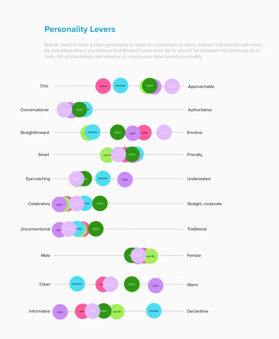
Brand Personality Levers
Guiding Questions
- How can we create a brand that promotes sustainability and transparency?
- How might we explain Rooted Living's offerings in a clear and informative way?
- How might we create a cohesive brand?
Creating a Brand Strategy
We started the brand strategy build process by dividing the exploratory work. We were each assigned different brand principles and given a day or two to come up with a simple concept for a brand. We presented these brand "sketches" to Rachel and got feedback.
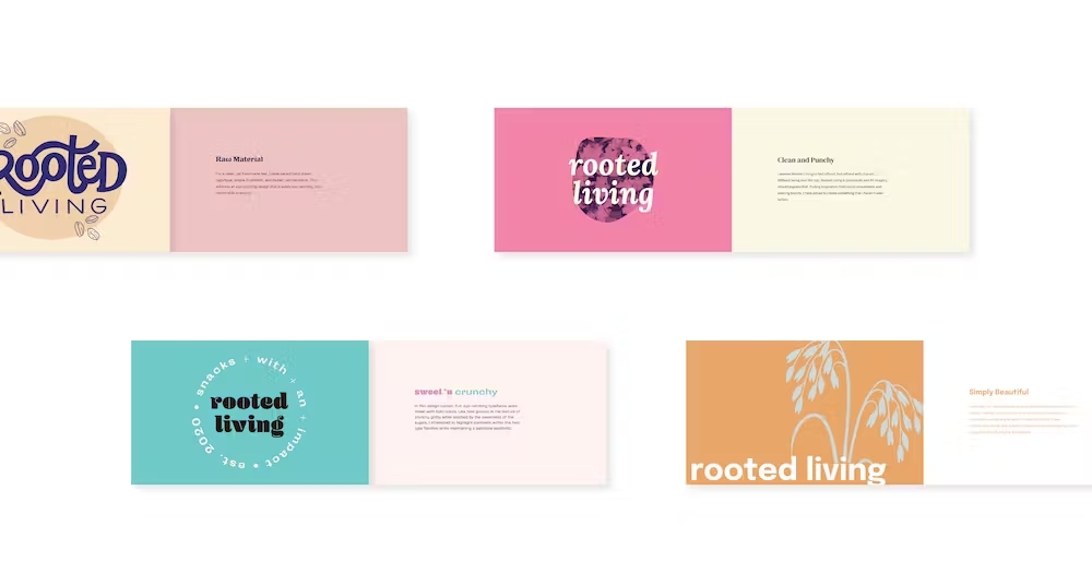
Balancing Organic and Refined
We ended up leaning towards a vibe that felt hand-drawn and natural, yet still polished. We hit a small snag when Rachel worried it might be too earthy/organic. She didn't want Rooted Living to come off as too "crunchy granola," but she could see the appeal in the basic idea. Ultimately, we devised a strategy to strike a balance between natural and clean aesthetics.
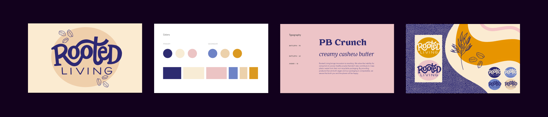
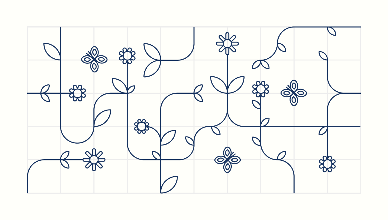
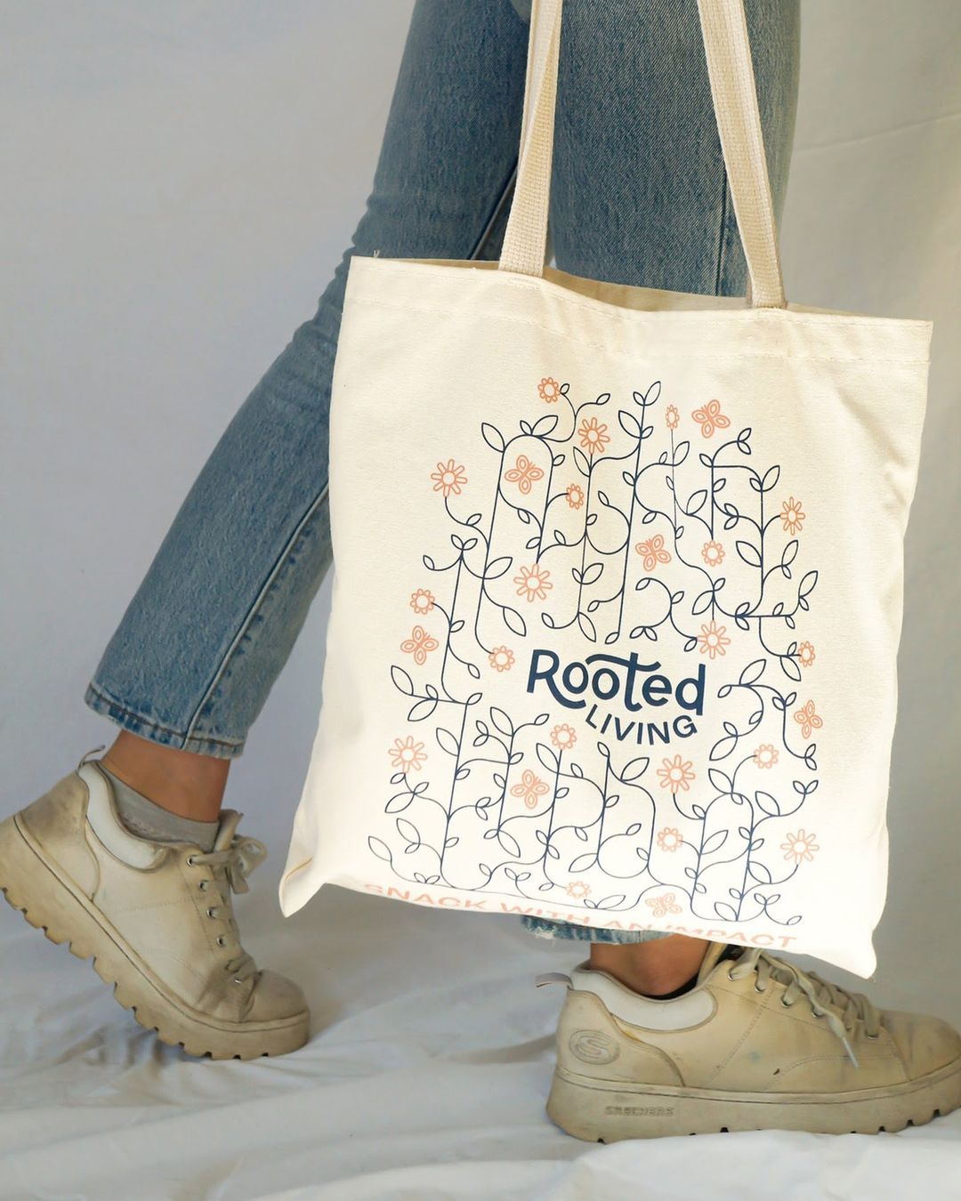
Illustration System
Rachel felt that the visual aspects of the brand were too naturalistic and "hand-drawn feeling". We needed to devise an illustration system that both captured the nature loving voice of the brand while maintaining the refined, polished feel that the client preferred. I was working on potential logo directions when I made something that fit really well.
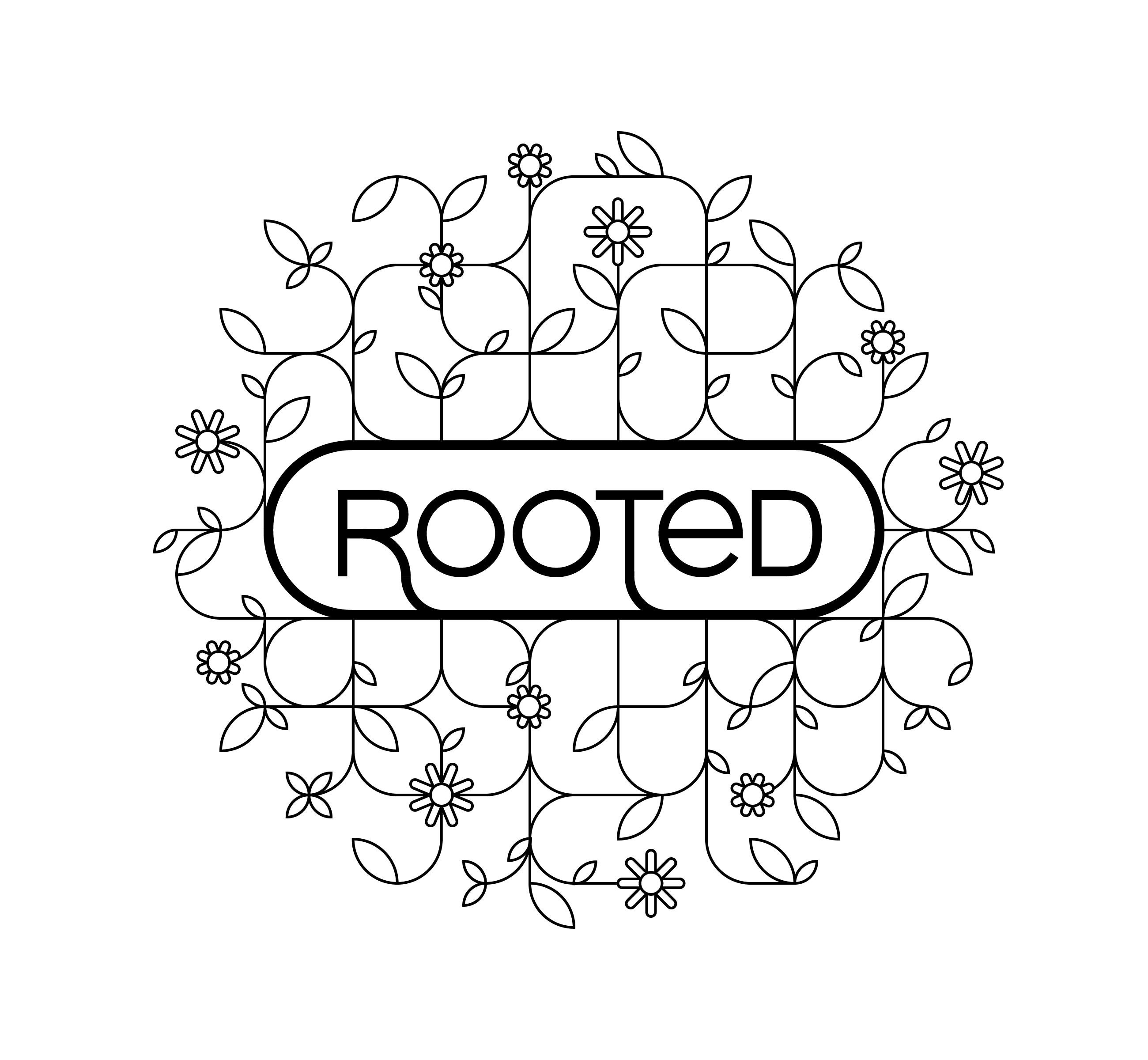
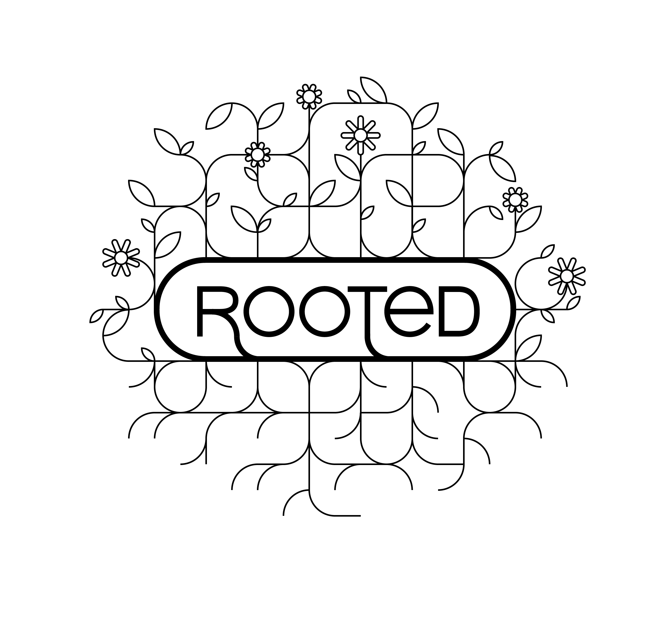
Growing the Illustration System
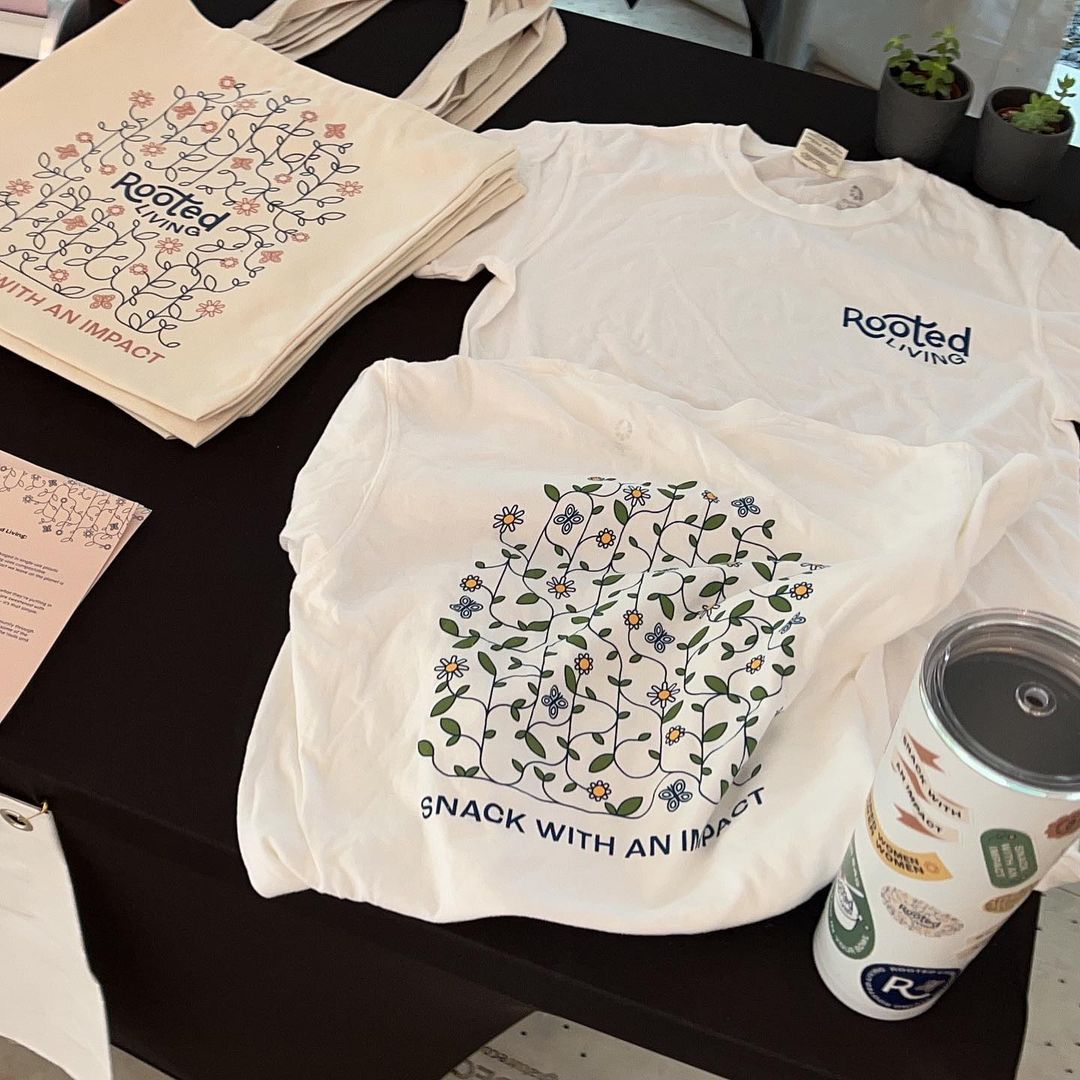
The client and the team really liked the illustration system. As it was both organic and clean, It seemed to fit the needs of the brand well. I was asked to persue the illustration system more. I came up with a grid system to standardize the white space in the system. The balance of the line weight and the grid size was important. I also wanted the illustration system to be modular and easy to use for future designers that work on the project.
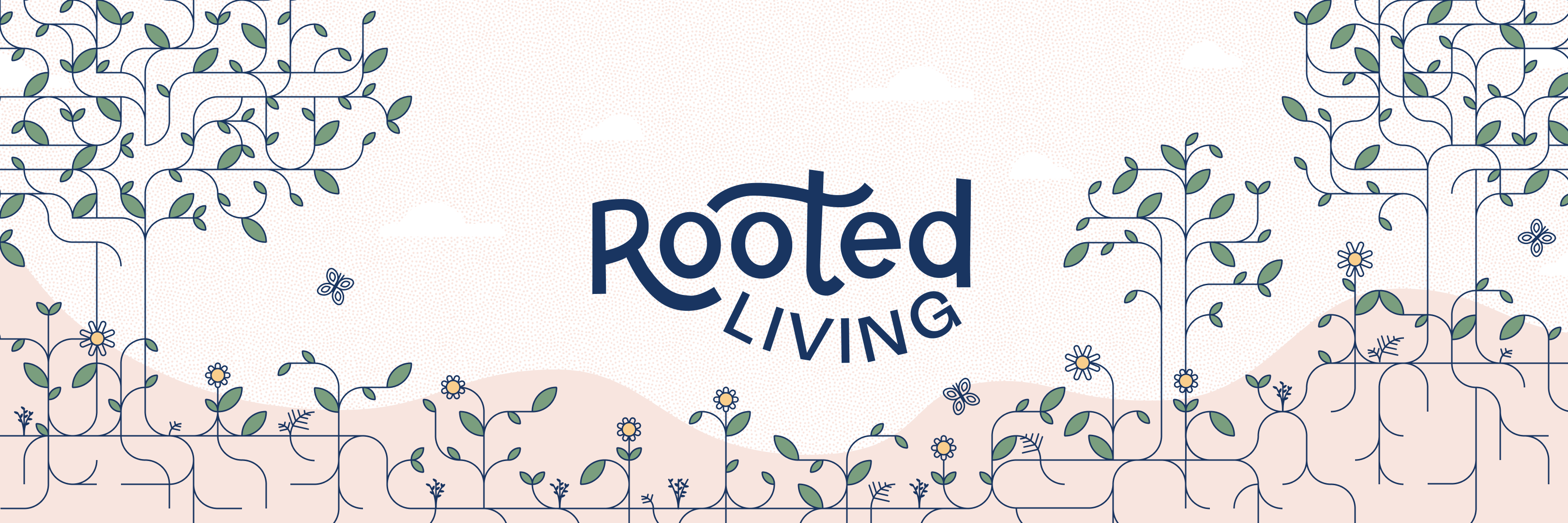
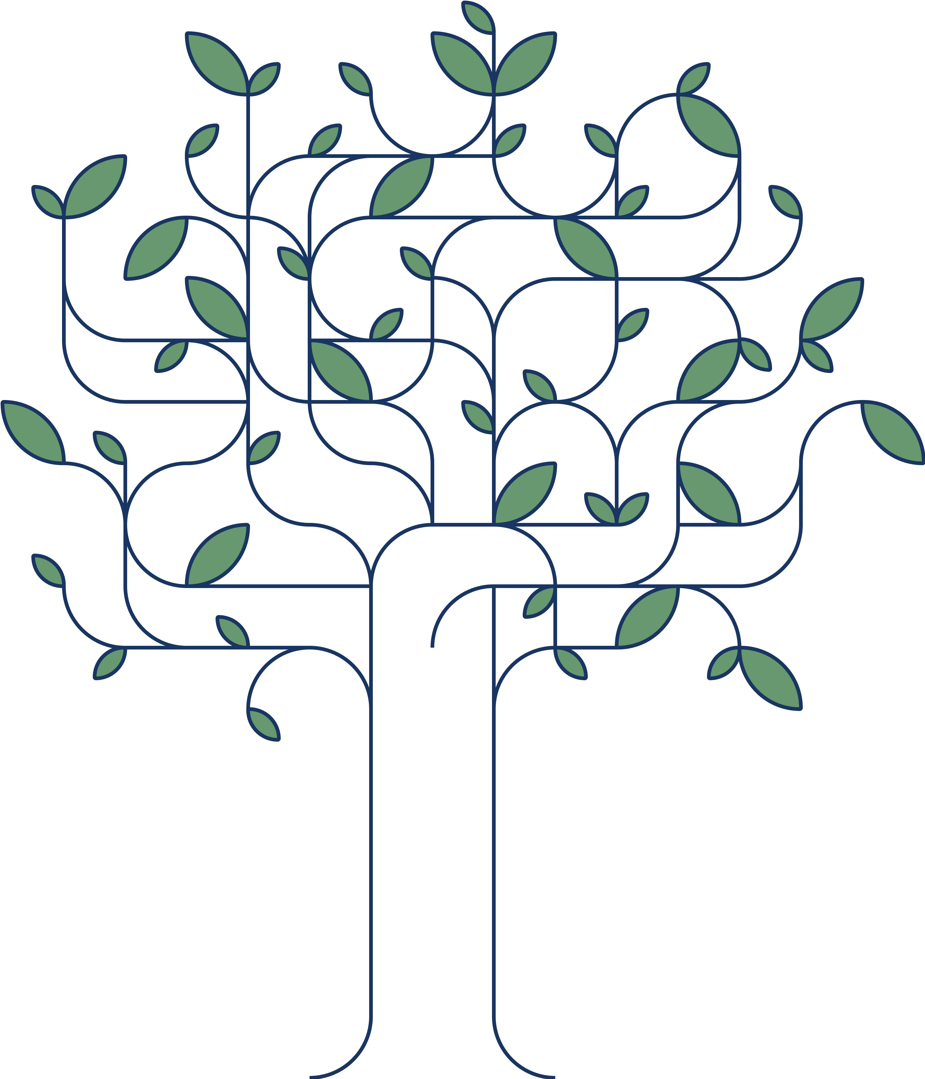
Final Illustration System In Use

Packaging Design
We approached packaging designs with a modified website design process. We created a main primary customer persona, listed necessary features, and prioritized them.
Necessary Features
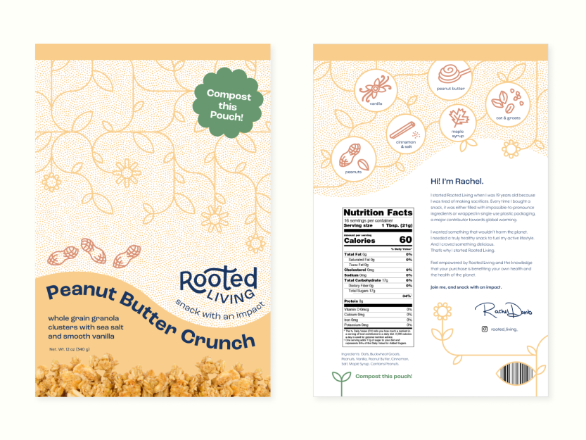
Our main user persona is a health-conscious young adult. As a health-conscious young adult, I want to...
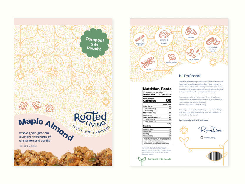
- Read the nutritional information so that I can be assured that the snack is good for me.
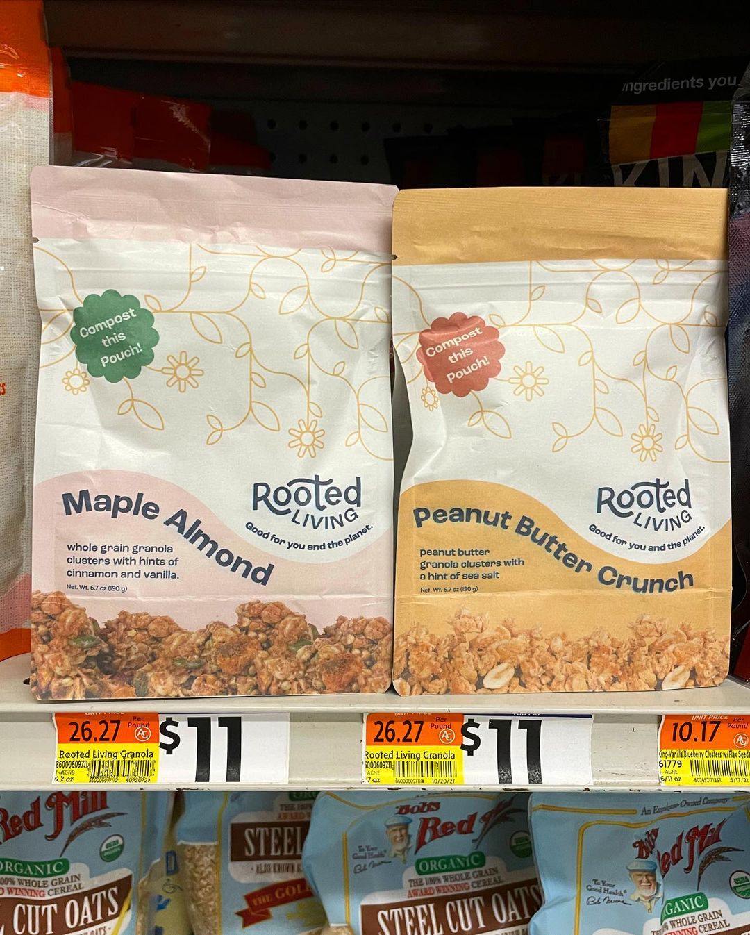
- Know the packaging is compostable so that I can support the health of the planet.
- Learn who the owner is so that I can feel connected to the founder and their values.
- Be able to see the ingredients on the package so that I can be informed about what I'm buying.
Final Packaging
We dedicated several weeks to refining and collaborating with the client on the packaging design, engaging in an iterative process to ensure it aligns effectively with the needs of our user persona. I wish I could show some of the drafts we came up with but I do not have access to those files as of right now.
Social Media Posts
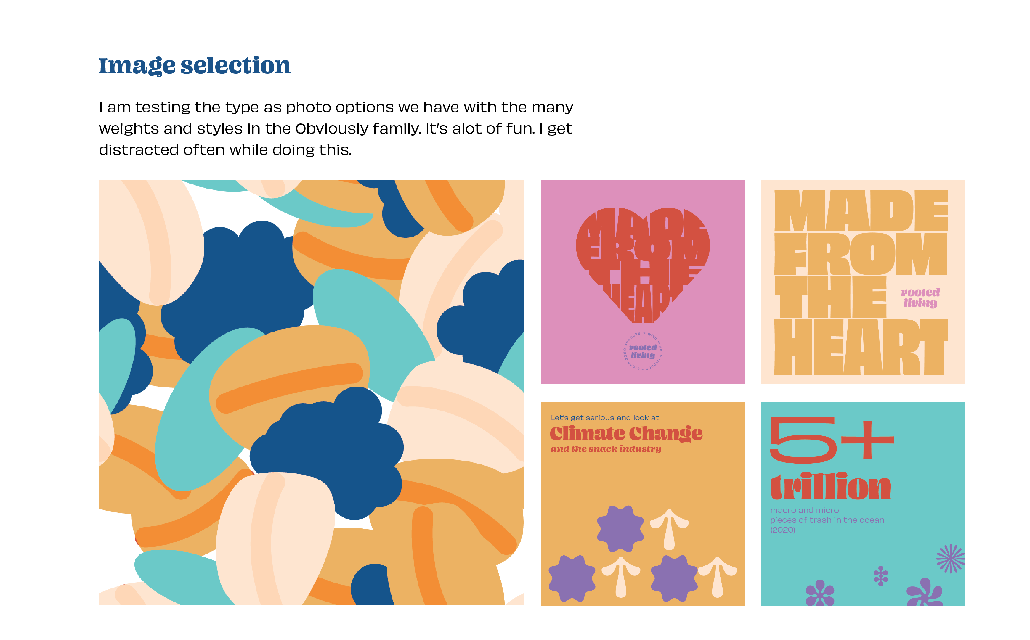
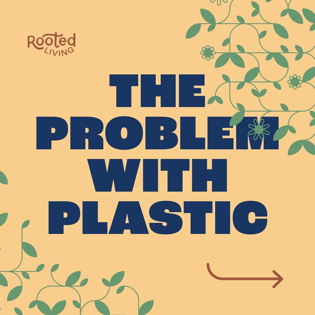
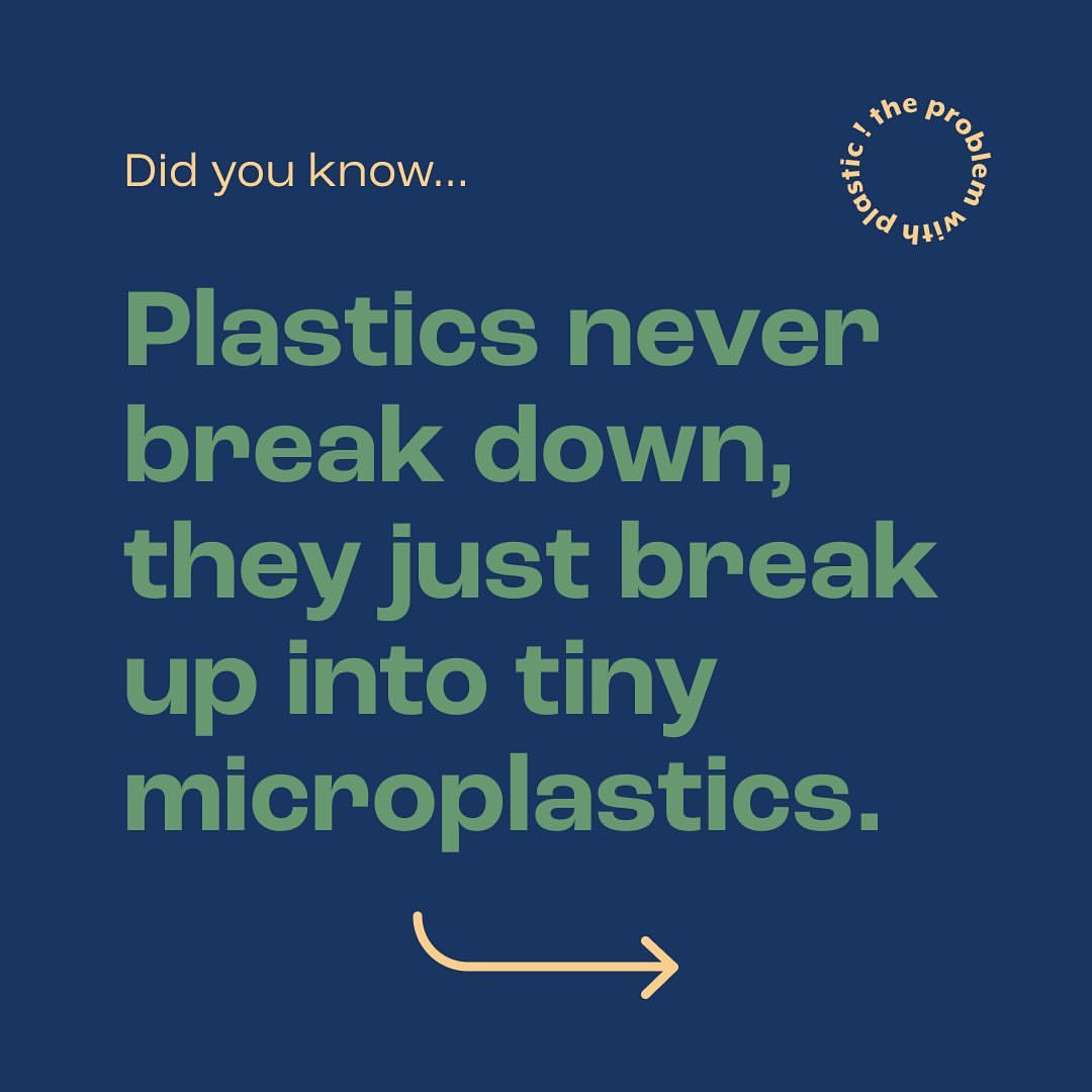
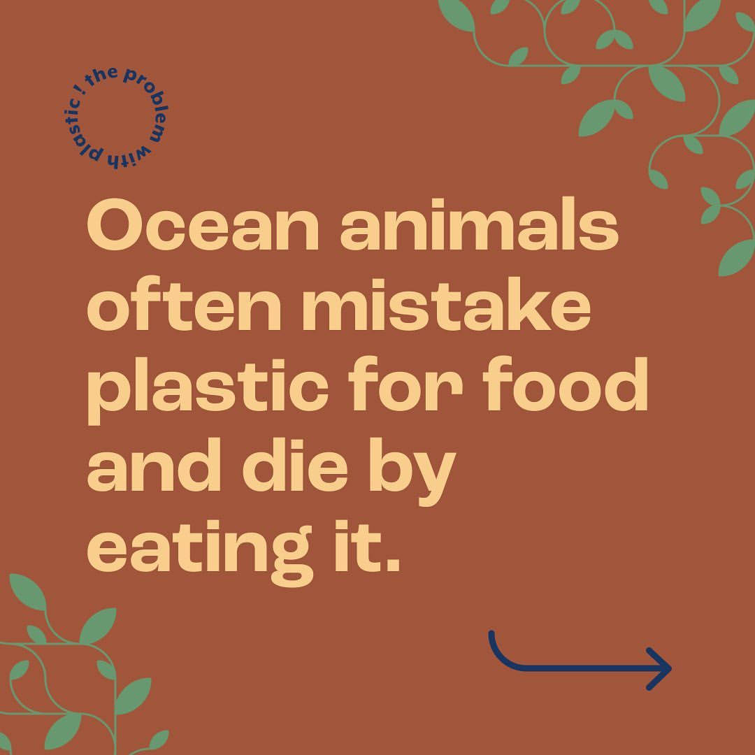
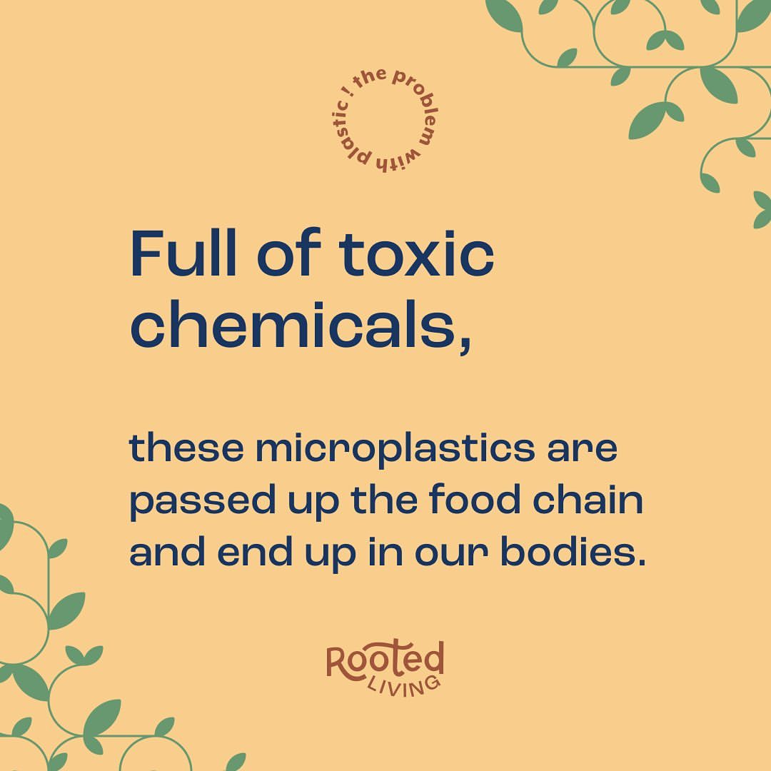
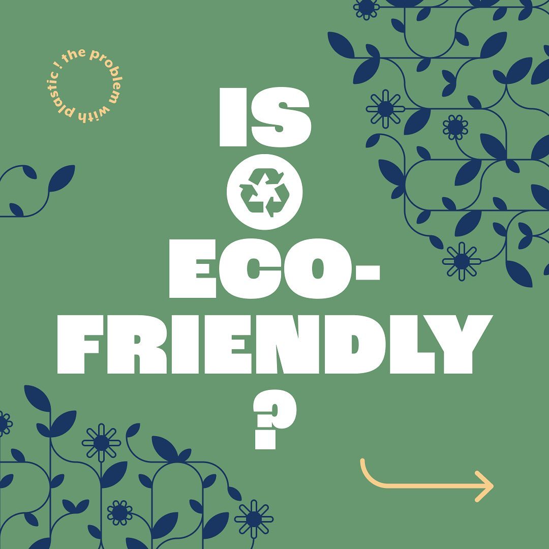
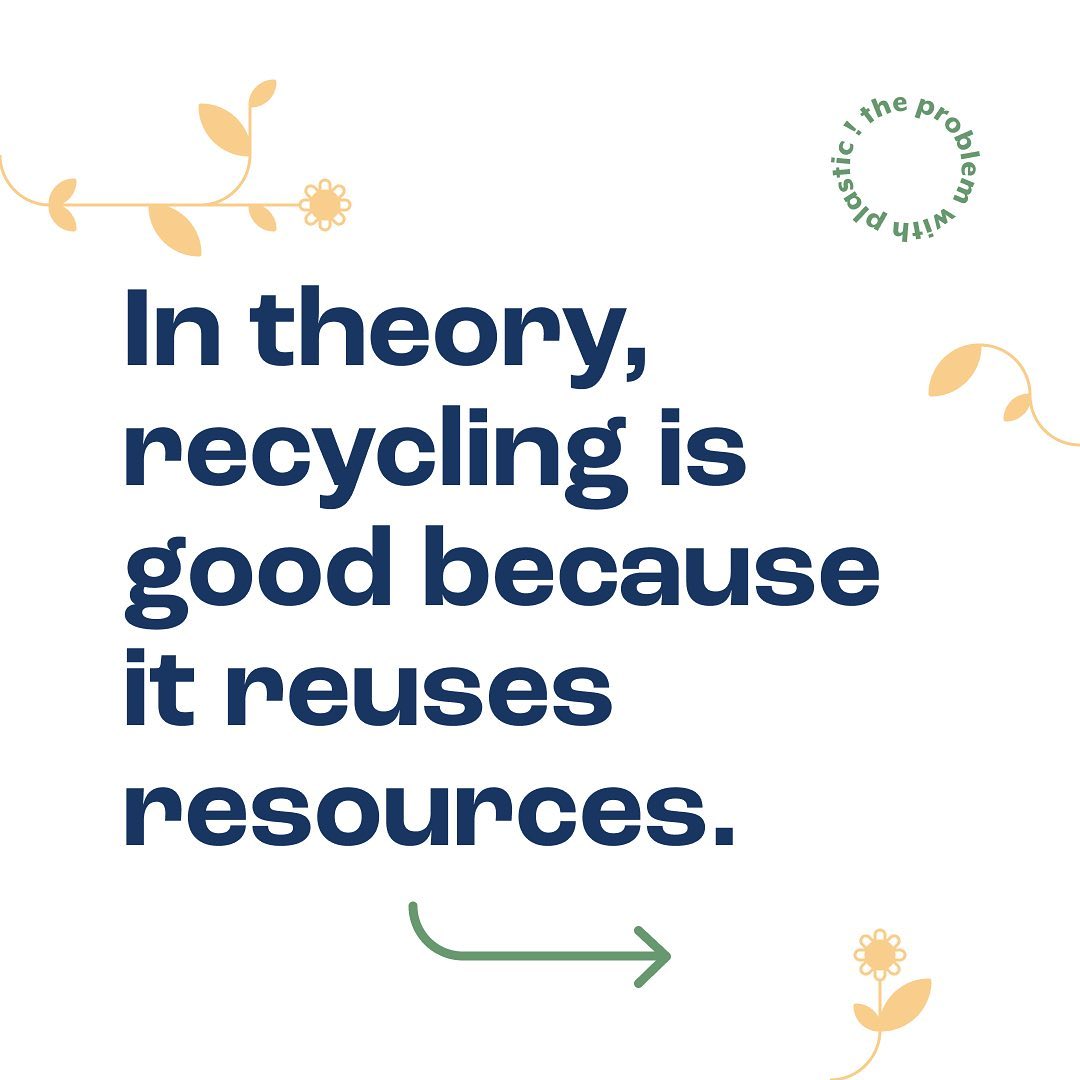
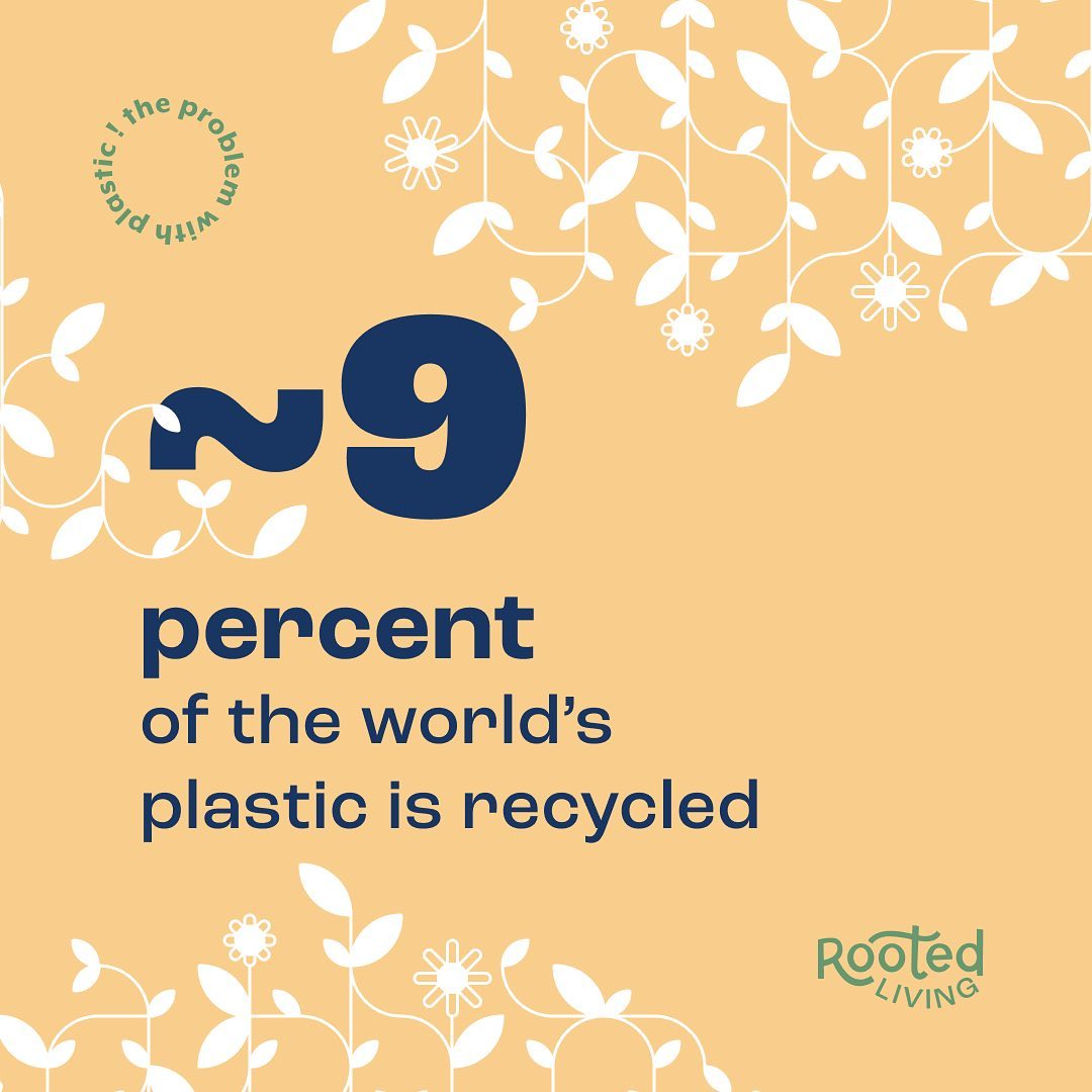
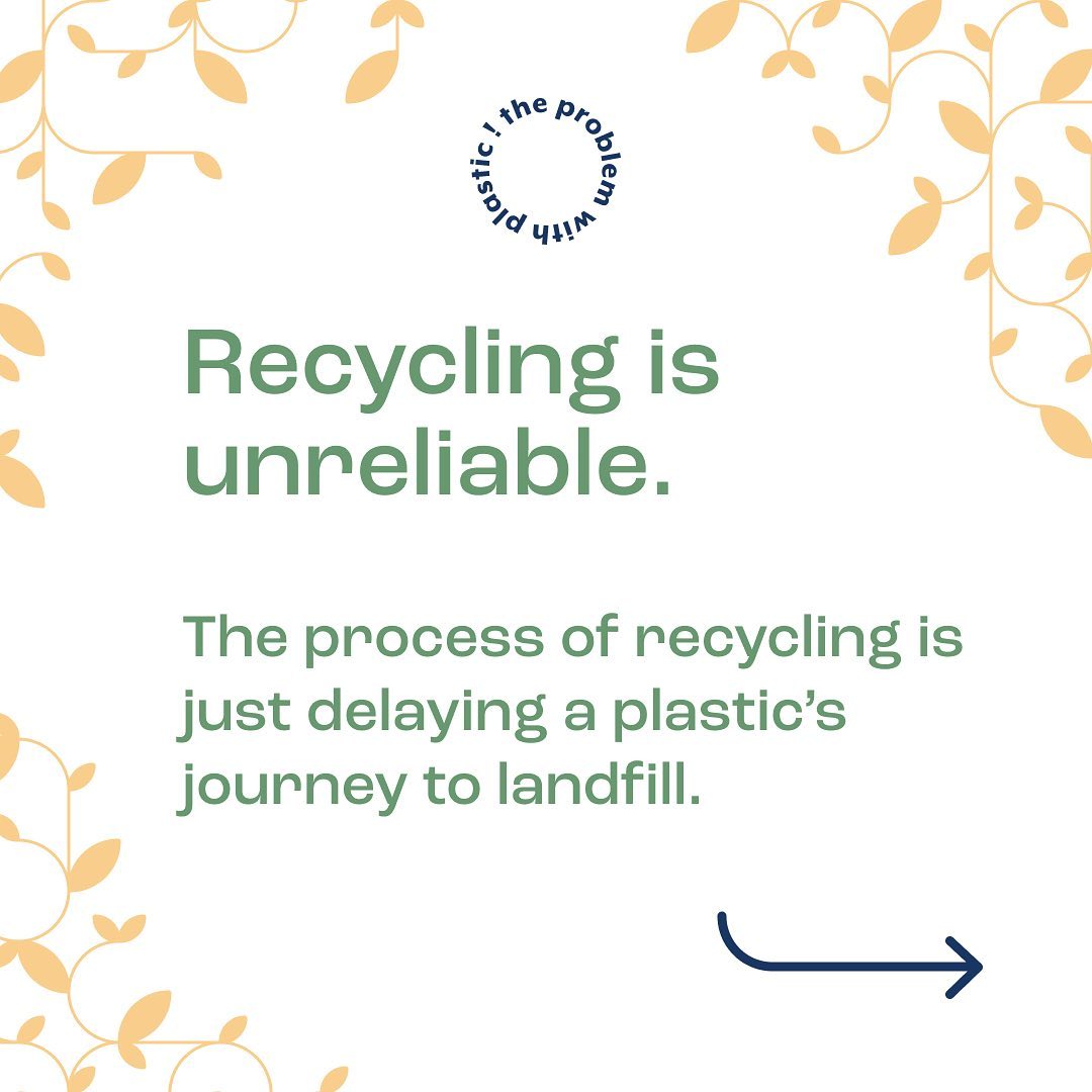
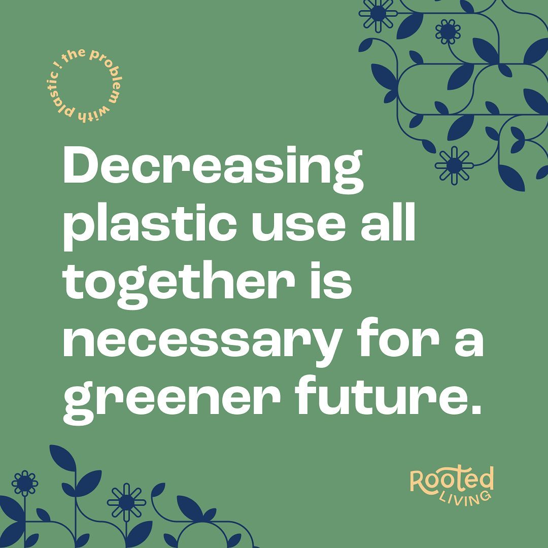
Rachel wanted to use social media as an educational tool, so we designed templates centered around this goal. I was assigned to create a template that can be used to present text based informative posts. I used this template to do a series on plastic packaging and recycling
The Problem With Plastic
Is Recycling Eco Friendly?
Reflection
The Importance of Workshop Exercises
Before this experience, I never really used design sprit exercises (Brand Personality Levers, Words to Describe a Brand, etc.) in a formal project for a client. It was really useful to get everyone on the same page when brainstorming the brand identity. It also aided in formulating questions that served as guiding principles throughout the entire design process.
We used FigJam as a canvas to set up these exercises, which is really nice so that there is always a digital record of the workshop.
A Collaborative Team Environment
I really enjoyed the time spent with Sam M., Phoebe, Josie, and Sam S. Together, we fostered an atmosphere characterized by open communication and mutual respect. We were all about chatting openly and giving each other props, and critiques for our ideas. It was a place where I felt comfortable pushing boundaries and experimenting. We knew where we were headed with our designs, but we also weren't afraid to take detours along the way. Prior to this, I never worked with a tight-knit group of designers before, so it was a really eye-opening experience. I would love to work on a team like this again.