Overview
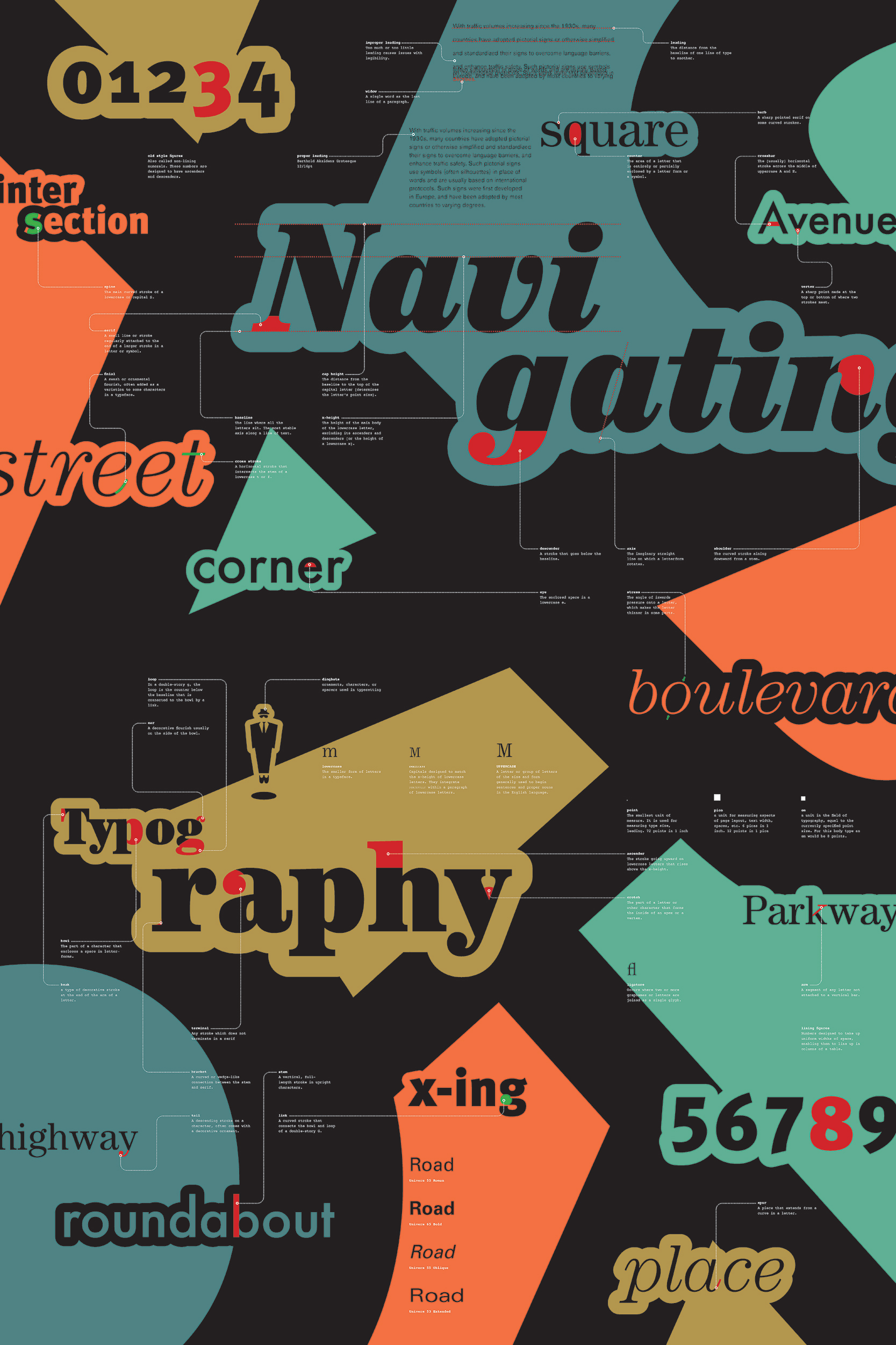
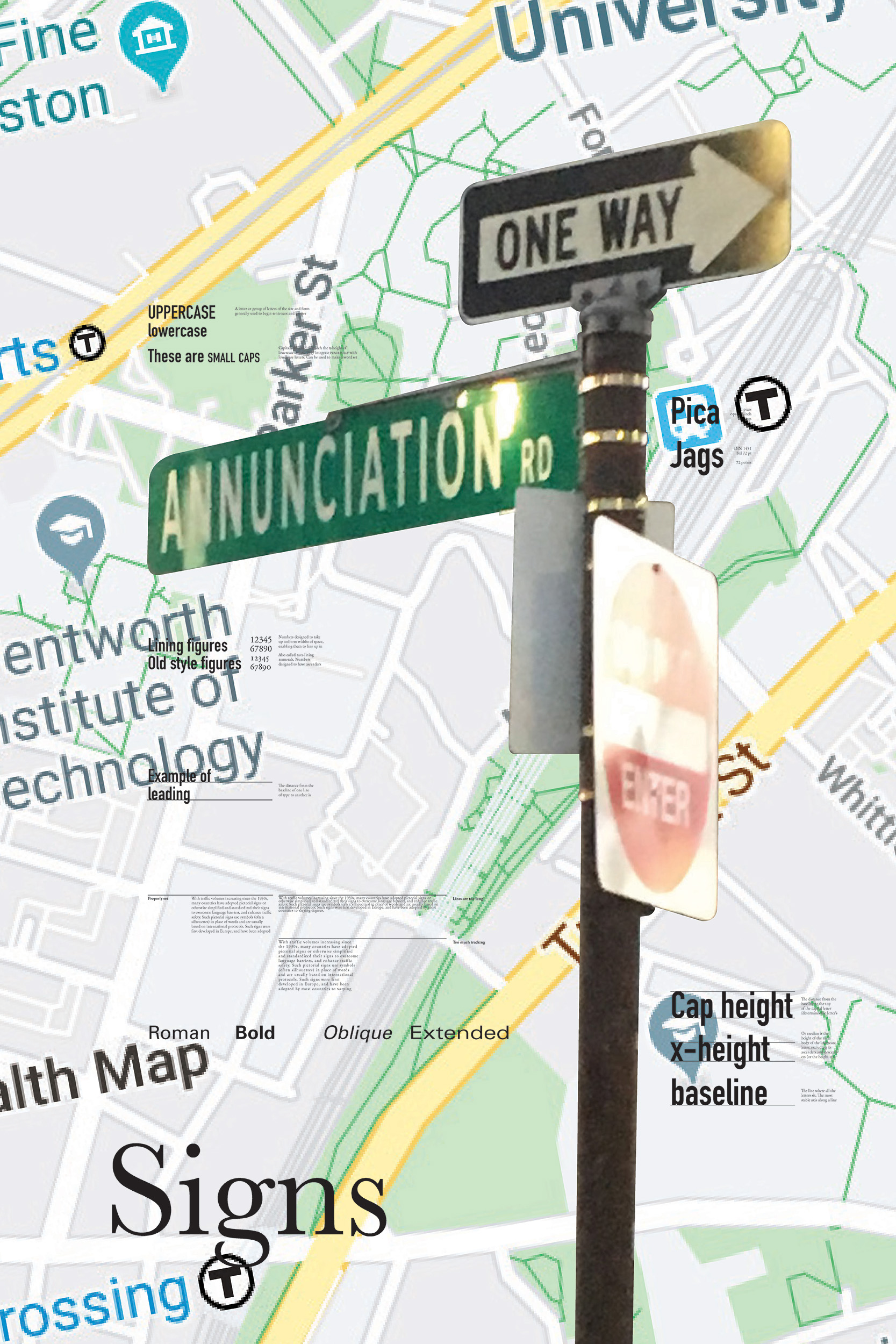
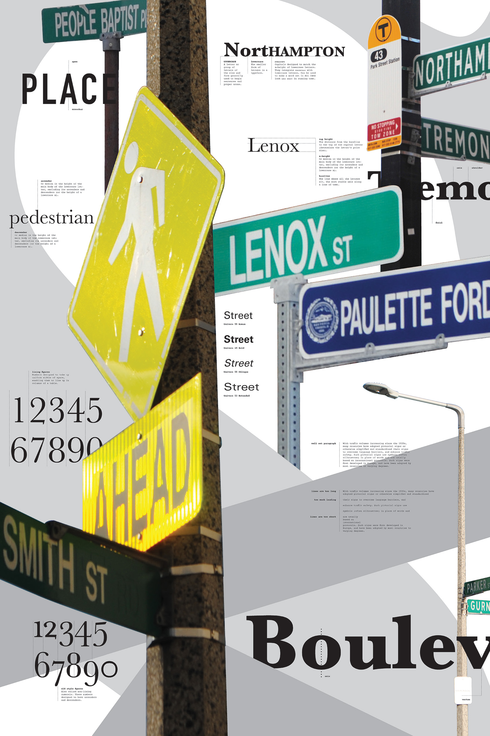
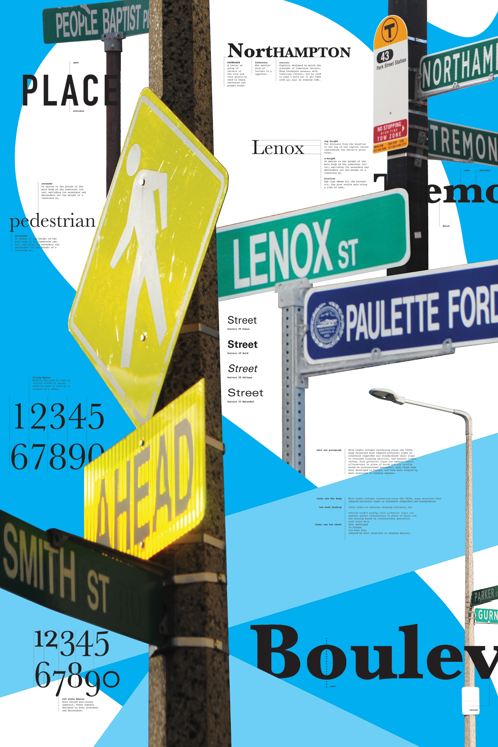
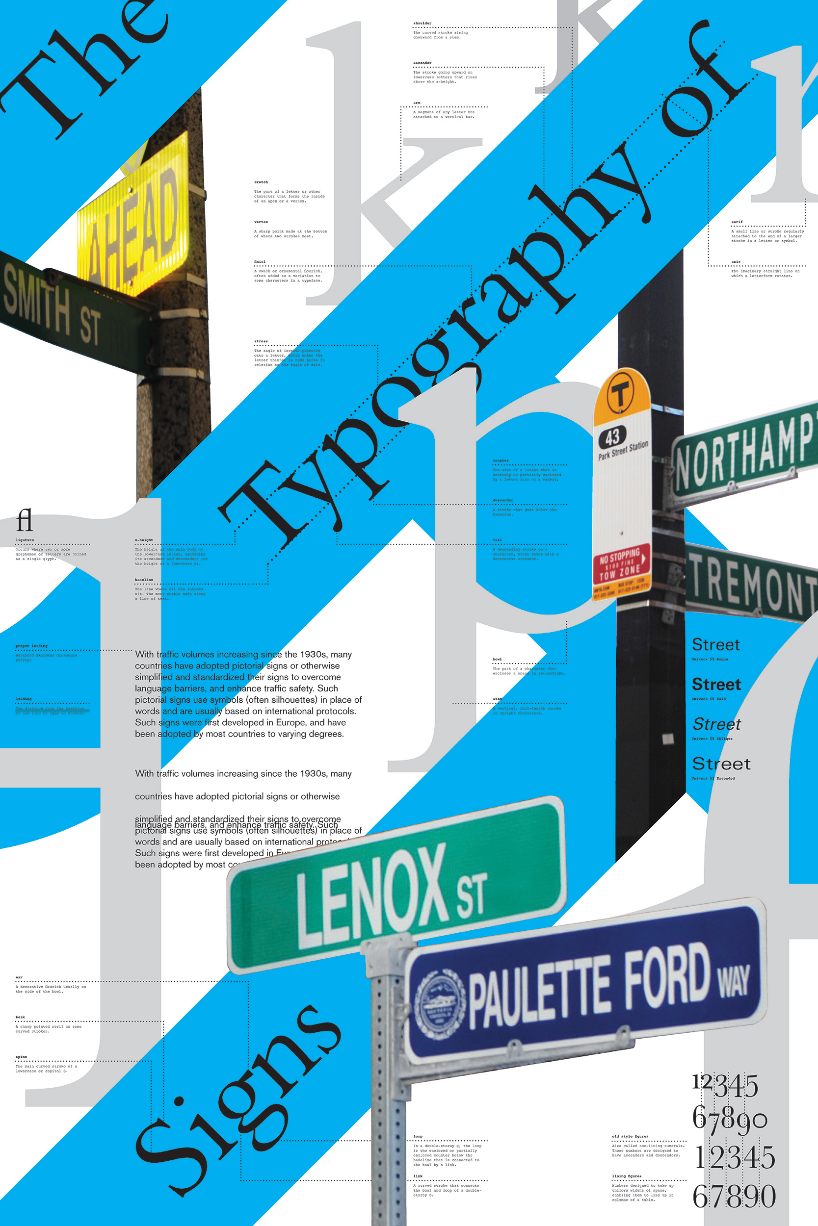
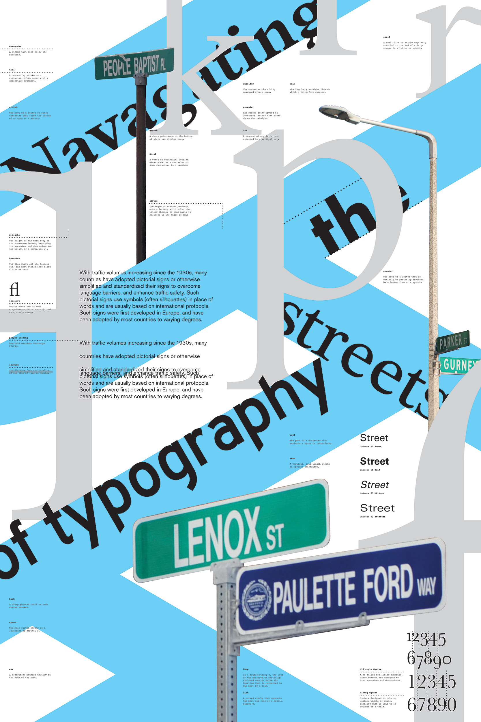
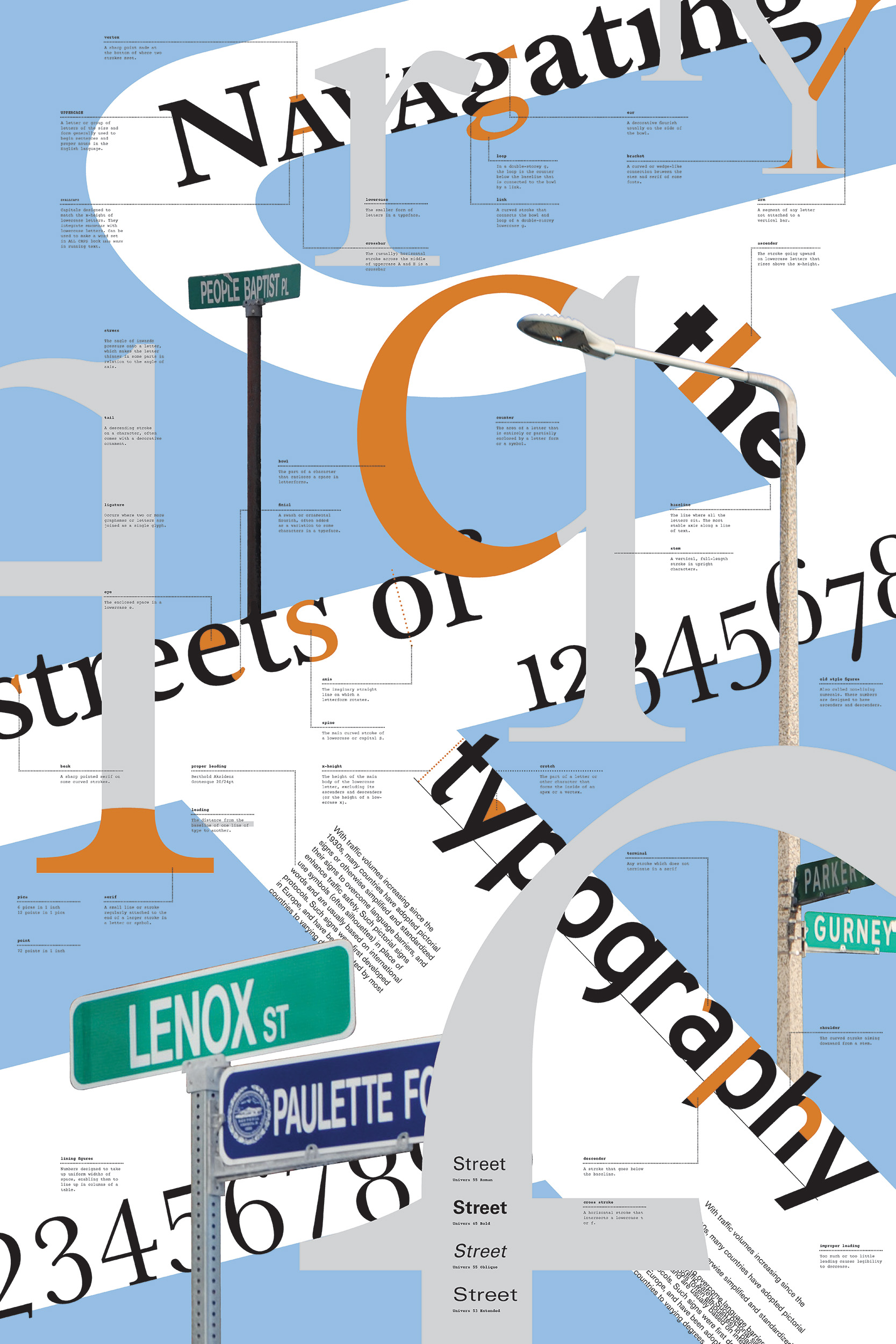
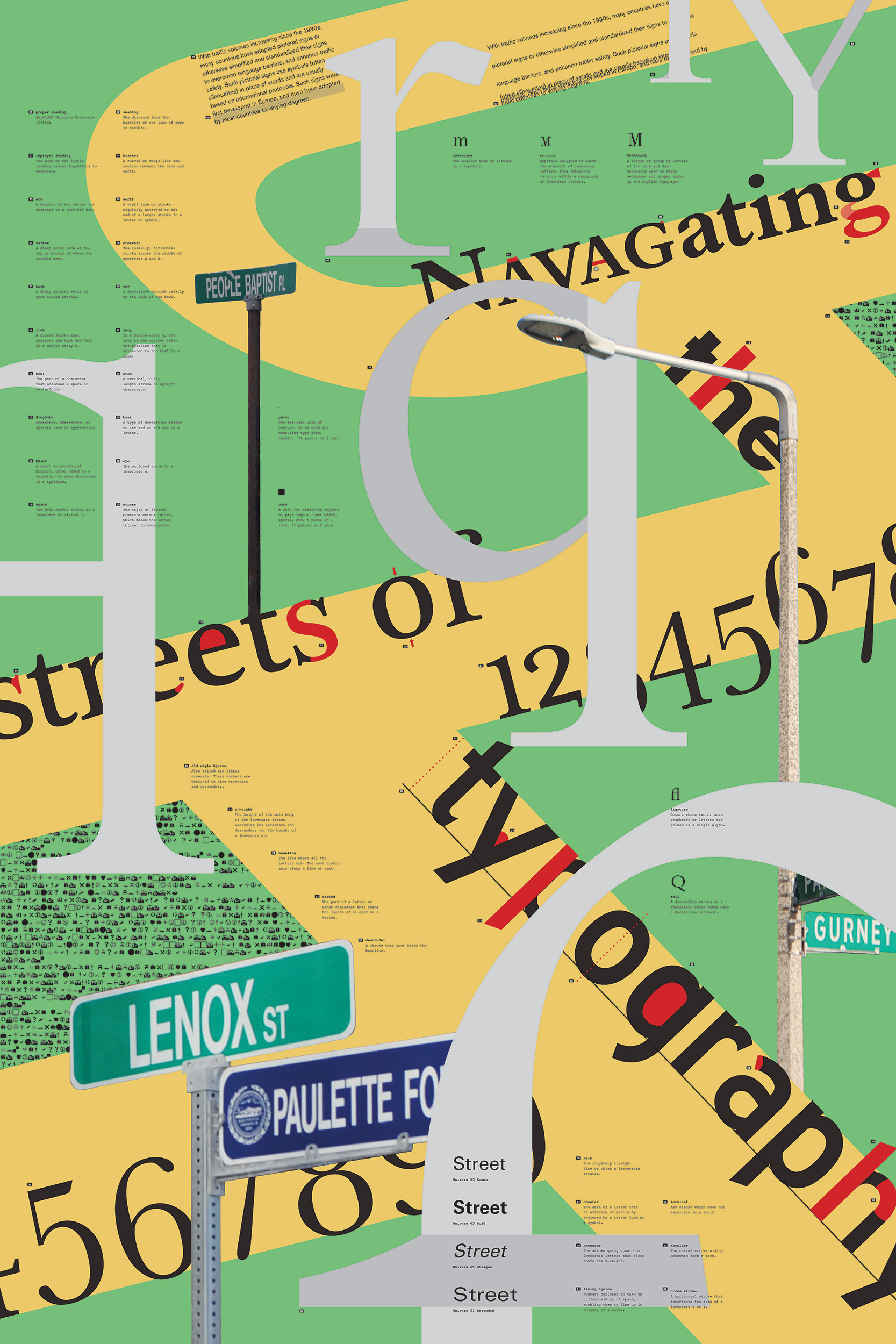
I went through many iterations and explorations in the process of creating this poster. I started with the idea of wanting to focus the type exploration on the public signage we see every day in the streets. I wanted my poster to emulate the chaos of the signage in the street. I photographed many signs and experimented with creating a streetscape with letterforms. After receiving a lot of useful critique from my classmates I decided to scrap the sign idea and just stick with the letterform streetscape to maintain readability and structure in my poster.
Final Poster
Iteration Process
Throughout the semester I tried a variety of different layouts and concepts. I originally wanted to focus on all the typography you see on the signs in the streets; however, since the streets in the U.S. is all labelled with Highway Gothic (Interstate), I could not find enough examples of the typographic concepts to create a full poster. I pivoted sometime within the semester.
Jump to the Final Draft
It was nearing the end of the semester and I was getting frustrated as the design still did not feel complete. Overnight, I actually started from a blank canvas and cooked up the ideas for the final design in one go.